Example
Installation
The hmap package is part of the Python Package Index (PyPI) and can be installed via (pip)
pip install hmap
Alternatively you can visit the projects github page and clone the repository
Create a figure layout
import sys
import hmap
import matplotlib.pyplot as plt
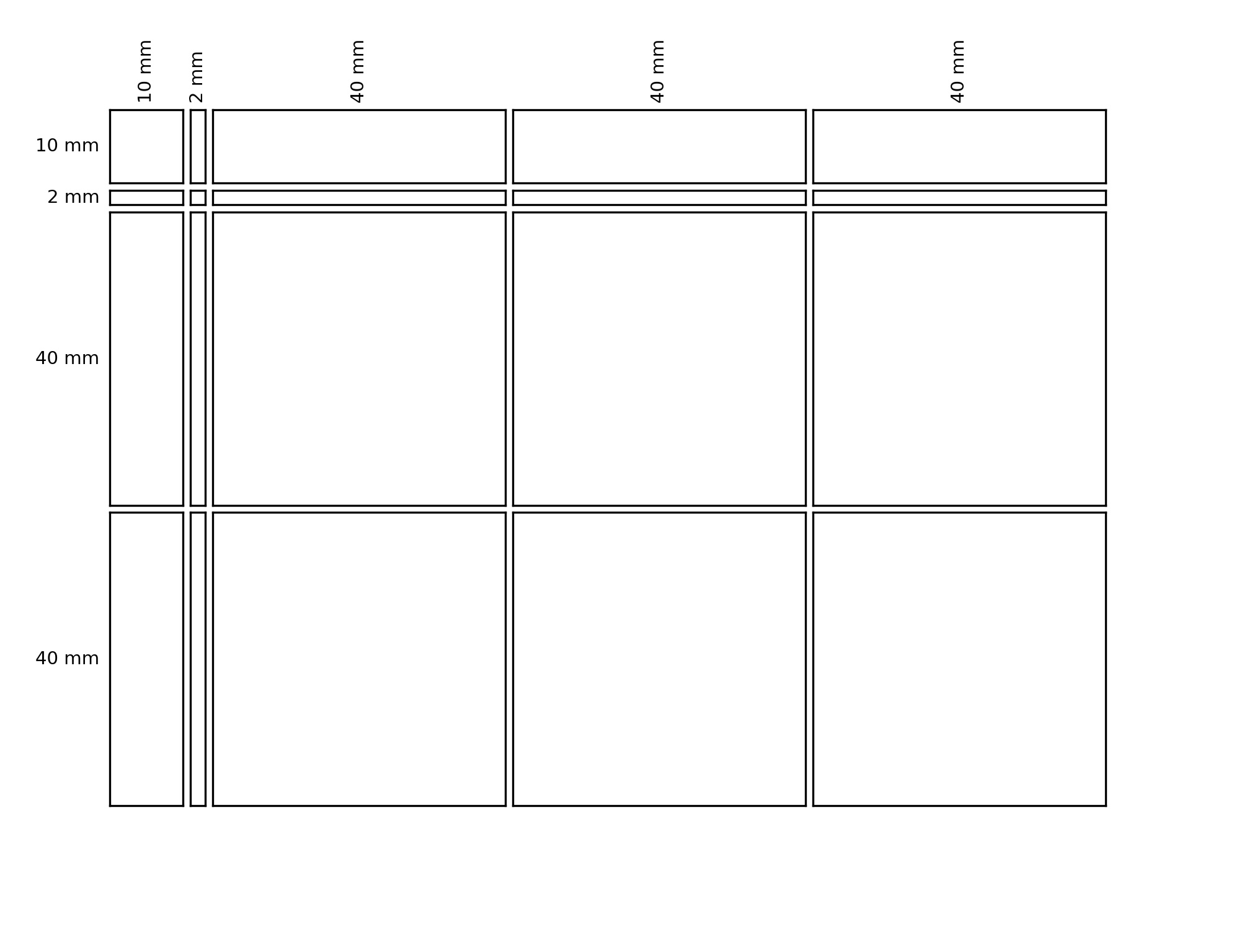
fig, gs = hmap.layout.layout.layoutGrid(4, 5, [10., 2., 40., 40., 40], [10., 2., 40., 40.], 1., 1., 20., 15., 15., 20.)
col_widths = ["10 mm", "2 mm", "40 mm", "40 mm", "40 mm"]
row_heights = ["10 mm", "2 mm", "40 mm", "40 mm"]
for row_idx in range(4):
for col_idx in range(5):
ax = plt.subplot(gs[row_idx, col_idx])
plt.xticks([], [])
plt.yticks([], [])
if(row_idx == 0):
ax.xaxis.set_label_position("top")
plt.xlabel(col_widths[col_idx],
fontsize=7,
rotation=90)
if(col_idx == 0):
plt.ylabel(row_heights[row_idx],
fontsize=7,
rotation=0,
horizontalalignment="right",
verticalalignment="center")
The image created by the code abve looks as follows
Create a random dataset for clustering
import sys
import hmap
import numpy as np
import pandas as pnd
import matplotlib.pyplot as plt

cell1_df = pnd.DataFrame(np.random.randn(50, 50)*5,
                            index = [ "var"+str(i) for i in range(50)],
                            columns = [ "sample"+str(i) for i in range(50)])

cell2_df = pnd.DataFrame(np.random.randn(50, 50)*5+5,
                            index = [ "var"+str(i) for i in range(50)],
                            columns = [ "sample"+str(i) for i in range(50, 100)])

cell3_df = pnd.DataFrame(np.random.randn(50, 50)*5+5,
                            index = [ "var"+str(i) for i in range(50, 100)],
                            columns = [ "sample"+str(i) for i in range(50)])

cell4_df = pnd.DataFrame(np.random.randn(50, 50)*5,
                            index = [ "var"+str(i) for i in range(50, 100)],
                            columns = [ "sample"+str(i) for i in range(50, 100)])

data_matrix_df = cell1_df.join(cell2_df).append(cell3_df.join(cell4_df))

# Create some row (Variables), and column (samples) annotation

row_annotation_df = pnd.DataFrame(np.array(["low"]*50+["high"]*50),
                                  index = data_matrix_df.index,
                                  columns = ["DA.RESULTS"])

column_annotation_df = pnd.DataFrame(np.array(["case"]*50+["control"]*50),
                                  index = data_matrix_df.columns,
                                  columns = ["SAMPLE.GROUPING"])

# Create color codes for categorial variables

color_dict = {"DA.RESULTS": {"low": "b",
                             "high": "r"},
              "SAMPLE.GROUPING": {"case": "orange",
                                  "control": "green"}}
In the following we will use the pandas.DataFrame data_matrix_df for hierarchical clustering and plotting. We also use the pandas.DataFrame s row_annotation_df and column_annotation_df for annotation of the rows and columns. Furthermore, we defined a dictionary color_dict, that defines the colors of the different annotation categories.
Hierarchical clustering and heatmap plotting
# Create layout for figure
fig, gs = hmap.layout.layout.layoutGrid(3, 4, [10., 2., 80., 40.], [10., 2., 80.], 1., 1., 20., 15., 15., 20.)

# Determine distancemetric and linkage method used for hierarchical clustering
distance_metric = "euclidean"
linkage_method = "ward"

# Plot heatmap
ax = plt.subplot(gs[2, 2])
r_heat = hmap.plot.basic.Heatmap(data_matrix_df,
                                cmap = "seismic",
                                linkage_method = linkage_method,
                                distance_metric = distance_metric,
                                ax = ax)

# Plot column clustering dendrogram
ax = plt.subplot(gs[0, 2])
r_col_den = hmap.plot.basic.Dendrogram(data_matrix_df,
                                       distance_metric=distance_metric,
                                       linkage_method=linkage_method,
                                       axis = 1,
                                       n_clust = 2,
                                       ax = ax)

# Plot row clustering dendrogram
ax = plt.subplot(gs[2, 0])
r_row_den = hmap.plot.basic.Dendrogram(data_matrix_df,
                                       distance_metric=distance_metric,
                                       linkage_method=linkage_method,
                                       axis = 0,
                                       n_clust = 2,
                                       ax = ax)

# Plot column annotation
ax = plt.subplot(gs[1, 2])
column_ids_reordered = r_heat[0]
r_col_anno_sample_grouping = hmap.plot.basic.Annotation(column_ids_reordered,
                                                        column_annotation_df,
                                                        "SAMPLE.GROUPING",
                                                        color_list=hmap.plot.basic.colors["set22"],
                                                        axis = 1,
                                                        is_categorial = True,
                                                        color_dict=color_dict["SAMPLE.GROUPING"],
                                                        ax = ax)

# Plot row annotation
ax = plt.subplot(gs[2, 1])
row_ids_reordered = r_heat[1]
r_row_anno_sample_grouping = hmap.plot.basic.Annotation(row_ids_reordered,
                                                        row_annotation_df,
                                                        "DA.RESULTS",
                                                        color_list=hmap.plot.basic.colors["xkcd"],
                                                        axis = 0,
                                                        is_categorial = True,
                                                        color_dict=color_dict["DA.RESULTS"],
                                                        ax = ax)

# Plot Legends
ax = plt.subplot(gs[2, 3])
patch_list_dict = {"SAMPLE.GROUPING": r_col_anno_sample_grouping,
                   "DA.RESULTS": r_row_anno_sample_grouping}
hmap.plot.basic.Legends(patch_list_dict,
                        ax = ax)
The above code results in the following annotated heatmap, that includes legends for the categorial annotations:

Hierarchical clustering and grouped heatmap plotting
Making use of the low-level plotting functions in the module hmap.plot.basic, as well as the figure layouting functionality in the module hmap.layout.layout it is possible to create heatmaps as complex as you wish. Let’s assume for example you are interested in subgrouped row and column clusterings based on the row and column annotations, where you want to show column clusterings for the case and control samples individually, and row clusterings for the high and low features individually, than the follwing code could be used:
# Create layout for figure
fig, gs = hmap.layout.layout.layoutGrid(4, 5, [10., 2., 40., 40., 40], [10., 2., 40., 40.], 1., 1., 20., 15., 15., 20.)

# Determine distancemetric and linkage method used for hierarchical clustering
distance_metric = "euclidean"
linkage_method = "ward"

var_ids_low = row_annotation_df[row_annotation_df["DA.RESULTS"] == "low"].index
var_ids_high = row_annotation_df[row_annotation_df["DA.RESULTS"] == "high"].index
sample_ids_case = column_annotation_df[column_annotation_df["SAMPLE.GROUPING"] == "case"].index
sample_ids_control = column_annotation_df[column_annotation_df["SAMPLE.GROUPING"] == "control"].index

min_val = np.min(np.min(data_matrix_df))
max_val = np.max(np.max(data_matrix_df))

# Determine row orderings for high variables
r_heat_high = hmap.plot.basic.Heatmap(data_matrix_df.loc[var_ids_high, :],
                                      linkage_method = linkage_method,
                                      distance_metric = distance_metric,
                                      show_plot=False)
row_ids_high_sorted = r_heat_high[1]

# Determine row orderings for high variables
r_heat_low = hmap.plot.basic.Heatmap(data_matrix_df.loc[var_ids_low, :],
                                      linkage_method = linkage_method,
                                      distance_metric = distance_metric,
                                      show_plot=False)
row_ids_low_sorted = r_heat_low[1]

# Determine row orderings for case samples
r_heat_case = hmap.plot.basic.Heatmap(data_matrix_df.loc[:, sample_ids_case],
                                      linkage_method = linkage_method,
                                      distance_metric = distance_metric,
                                      show_plot=False)
col_ids_case_sorted = r_heat_case[0]

# Determine row orderings for control samples
r_heat_control = hmap.plot.basic.Heatmap(data_matrix_df.loc[:, sample_ids_control],
                                      linkage_method = linkage_method,
                                      distance_metric = distance_metric,
                                      show_plot=False)
col_ids_control_sorted = r_heat_control[0]

# Plot heatmap for SAMPLE.GROUP == case & DA.RESULTS == high
data_matrix_case_high_df = data_matrix_df.loc[var_ids_high, sample_ids_case]
ax = plt.subplot(gs[2, 2])
r_heat_case_high = hmap.plot.basic.Heatmap(data_matrix_case_high_df,
                        cmap = "seismic",
                        linkage_method = linkage_method,
                        distance_metric = distance_metric,
                        vmin = min_val,
                        vmax = max_val,
                        row_clustering=False,
                        column_clustering=False,
                        custom_row_clustering=row_ids_high_sorted,
                        custom_column_clustering=col_ids_case_sorted,
                        ax = ax)

# Plot heatmap for SAMPLE.GROUP == control & DA.RESULTS == high
data_matrix_control_high_df = data_matrix_df.loc[var_ids_high, sample_ids_control]
ax = plt.subplot(gs[2, 3])
r_heat_control_high = hmap.plot.basic.Heatmap(data_matrix_control_high_df,
                        cmap = "seismic",
                        linkage_method = linkage_method,
                        distance_metric = distance_metric,
                        vmin = min_val,
                        vmax = max_val,
                        row_clustering=False,
                        column_clustering=False,
                        custom_row_clustering=row_ids_high_sorted,
                        custom_column_clustering=col_ids_control_sorted,
                        ax = ax)

# Plot heatmap for SAMPLE.GROUP == case & DA.RESULTS == low
data_matrix_case_low_df = data_matrix_df.loc[var_ids_low, sample_ids_case]
ax = plt.subplot(gs[3, 2])
r_heat_case_low = hmap.plot.basic.Heatmap(data_matrix_case_low_df,
                        cmap = "seismic",
                        linkage_method = linkage_method,
                        distance_metric = distance_metric,
                        vmin = min_val,
                        vmax = max_val,
                        row_clustering=False,
                        column_clustering=False,
                        custom_row_clustering=row_ids_low_sorted,
                        custom_column_clustering=col_ids_case_sorted,
                        ax = ax)

# Plot heatmap for SAMPLE.GROUP == control & DA.RESULTS == low
data_matrix_control_low_df = data_matrix_df.loc[var_ids_low, sample_ids_control]
ax = plt.subplot(gs[3, 3])
r_heat_control_low = hmap.plot.basic.Heatmap(data_matrix_control_low_df,
                        cmap = "seismic",
                        linkage_method = linkage_method,
                        distance_metric = distance_metric,
                        vmin = min_val,
                        vmax = max_val,
                        row_clustering=False,
                        column_clustering=False,
                        custom_row_clustering=row_ids_low_sorted,
                        custom_column_clustering=col_ids_control_sorted,
                        ax = ax)

# Plot row Dendrogram high
ax = plt.subplot(gs[2, 0])
r_den_high = hmap.plot.basic.Dendrogram(data_matrix_df.loc[var_ids_high, :],
                                        linkage_method=linkage_method,
                                        distance_metric=distance_metric,
                                        axis = 0)

# Plot row Dendrogram low
ax = plt.subplot(gs[3, 0])
r_den_low = hmap.plot.basic.Dendrogram(data_matrix_df.loc[var_ids_low, :],
                                        linkage_method=linkage_method,
                                        distance_metric=distance_metric,
                                        axis = 0)

# Plot col Dendrogram case
ax = plt.subplot(gs[0, 2])
r_den_case = hmap.plot.basic.Dendrogram(data_matrix_df.loc[:, sample_ids_case],
                                        linkage_method=linkage_method,
                                        distance_metric=distance_metric,
                                        axis = 1)

# Plot col Dendrogram control
ax = plt.subplot(gs[0, 3])
r_den_case = hmap.plot.basic.Dendrogram(data_matrix_df.loc[:, sample_ids_control],
                                        linkage_method=linkage_method,
                                        distance_metric=distance_metric,
                                        axis = 1)

# Plot Annotation high
ax = plt.subplot(gs[2, 1])
r_anno_high = hmap.plot.basic.Annotation(r_heat_high[1],
                               row_annotation_df,
                               "DA.RESULTS",
                               axis = 0,
                               color_dict = color_dict["DA.RESULTS"])
plt.xlabel("")

# Plot Annotation low
ax = plt.subplot(gs[3, 1])
r_anno_low = hmap.plot.basic.Annotation(r_heat_low[1],
                               row_annotation_df,
                               "DA.RESULTS",
                               axis = 0,
                               color_dict = color_dict["DA.RESULTS"])


# Plot Annotation case
ax = plt.subplot(gs[1, 2])
r_anno_case = hmap.plot.basic.Annotation(r_heat_case[0],
                               column_annotation_df,
                               "SAMPLE.GROUPING",
                               axis = 1,
                               color_dict = color_dict["SAMPLE.GROUPING"])
plt.ylabel("")

# Plot Annotation control
ax = plt.subplot(gs[1, 3])
r_anno_control = hmap.plot.basic.Annotation(r_heat_control[0],
                               column_annotation_df,
                               "SAMPLE.GROUPING",
                               axis = 1,
                               color_dict = color_dict["SAMPLE.GROUPING"])

# Plot Legends
ax = plt.subplot(gs[2, 4])
patch_dict = {"DA.RESULTS": [True, r_anno_high[1]+r_anno_low[1]],
              "SAMPLE.GROUPING": [True, r_anno_case[1]+r_anno_control[1]]}
hmap.plot.basic.Legends(patch_dict,
                        ax = ax)
The above code results in the following figure:
